I’m hoping that by now you may have read Watercolour Basics. Part 1. What You Need to Know.
In this second part of exploring working with watercolours, I’d like to break down how you might go about using this medium in your sketchbook.
I will be using an example to break down the different elements you need to think about when applying technique. Remember that I paint in a sketchbook which is slightly different to a final piece of artwork, nevertheless the same principles apply.
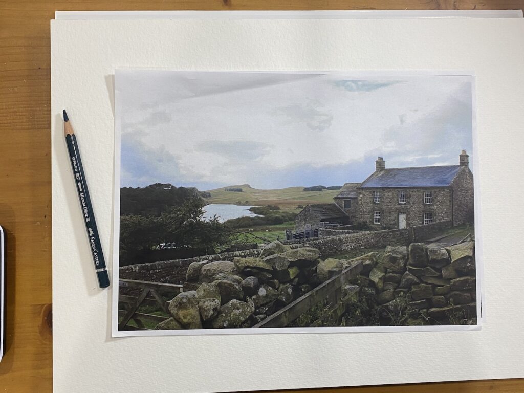
In today’s example I am using a landscape to demonstrate the step by step process, however, you can think about the type of subject you want to paint by using the following guidelines;
- I sketch the everyday which makes for limitless ideas that lend themselves well to watercolour. Look for variation in imagery so that you can experiment using different watercolour techniques as outlined in the first part of watercolour basics. Remember different subjects may call for different techniques.
- Include textures. Focus in on painting animals for example, as well as using different paintbrushes to achieve different textured effects.
- Utilise perspective! (Check out my step by step post on the subject.) Learning how to sketch in perspective can enhance a sketch when you utilise tones and shadows in your final piece.
- Tones and values to capture. Choose images that have striking contrasts. Why? These are quick to capture and can create a big impact with little paint.
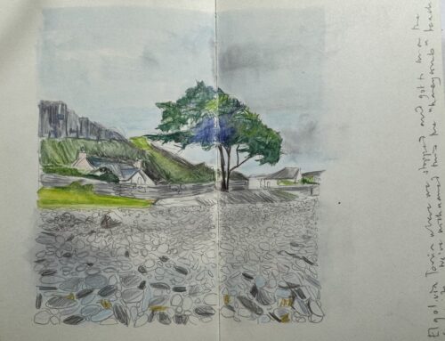
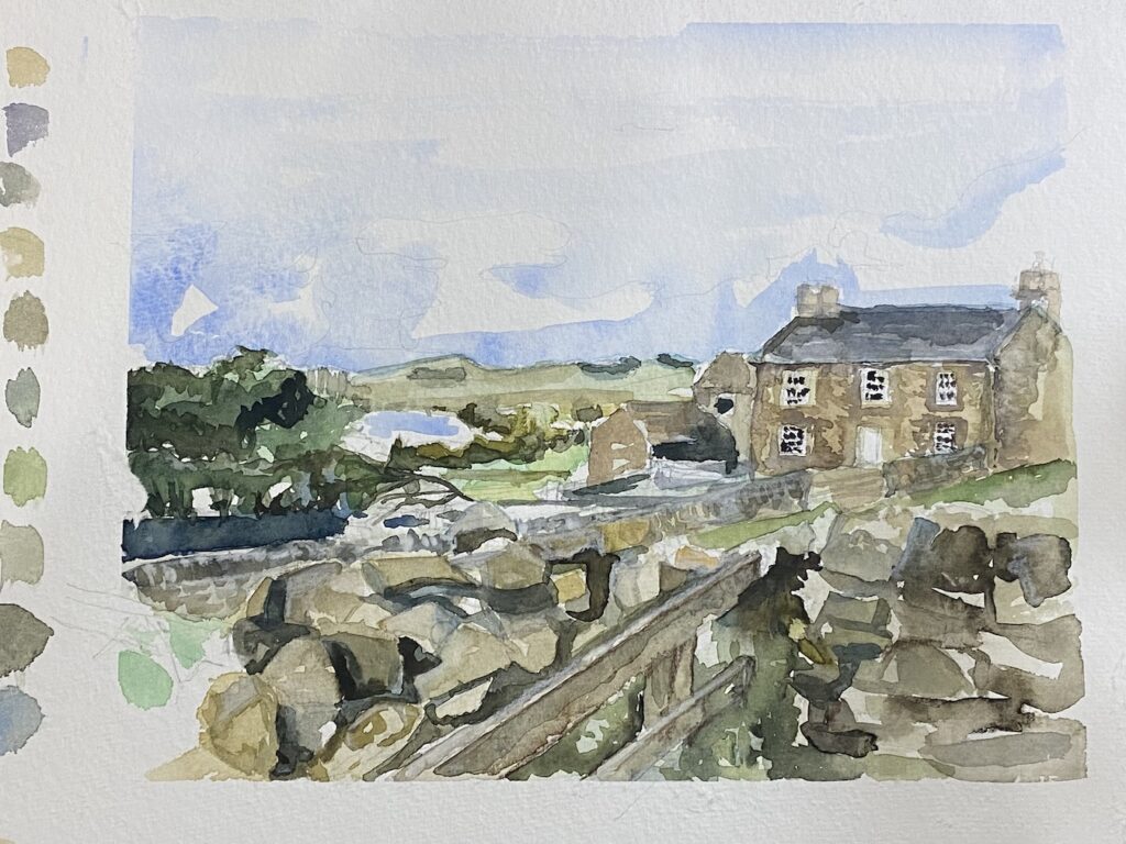
The landscape for those of you that are interested is taken from a hike I took along Hadrian’s Wall one autumn with my work colleagues at the CBI. The landscape is beautiful and I’m now thankful that I get to immortalise it in the subject of this post!
(Anyhow…..)
Table of Contents
Applying Watercolour Basics
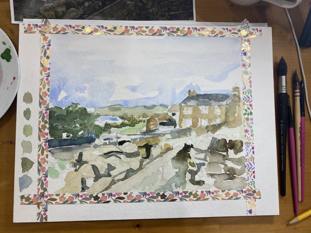
I am using a 500 gms / 230 lb weighted cold pressed paper by Hahnemuhle for this demo that is attached to a gummed block to ensure my paper does not warp.
I’m also using my Escoda Alvaro brushes to lay down my washes and quickly fill in the dark tonal areas. (These are brilliant and hard wearing!)
Remember too that the way in which I apply these basics may vary dependent on the amount of time I have available to me to paint.
Understanding Shapes
The first element to tackle, before you even pick up a paintbrush, is scoping out your sketch. Rather than a full composition lesson here I’d like to look at breaking down how I quickly understand the shapes.
Getting the skeleton of your image on the page and being happy with it is the first fundamental element to success.
If you’re feeling brave enough, use a watercolour pencil to rough out your drawing. A watercolour pencil neatly dissolves into the painting once you add water and can also add an interesting effect to your sketch. A basic soft B pencil, however will do too! (Make sure that the lead is not too dark as this can sometimes damage the integrity of your painting if it smudges under wet paint. You can rub out the pencil lines afterwards.) You can include as much or as little detail here as you like. I tend to find that this varies dependent on the amount of time I have for that particular watercolour. The less time I have, (e.g out and about) I will add more detail to my thumbnail sketches. The more time I have to work on different layers of a watercolour I might dedicate less to drawing the image and more to painting it. I would also gently outline the areas of the painting that need to stay white.
When you start a painting, always start from the entire visual that you are looking to create. Outline your frame, i.e the space within which the watercolour will sit within.
- Next I’d like you to almost see past the landscape or object you are looking at and imagine your visual is a jigsaw puzzle. Forget that it may have objects or items in the visual. Look instead for the shapes that you can see. When transcribing our 3D world into as realistic a portrayal into a 2D shape, attempt to accurately transcribe the shapes you see, doubly difficult if you are sketching live in the great outdoors! This exercise is important to capture so that the pieces all “fit” together.
- Understanding what negative and positive spaces mean on your paper would be helpful at this point.
- Look at the shapes you can see. Identify the main lines that break up your picture. Is there a clear delineation between sky and land, field and tree or any other markers? Break up your visual into a makeshift jigsaw.
- Start to look at what the colours and tones are doing too. The sky is ultimately always slightly lighter, trees slightly darker.
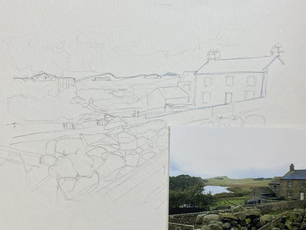
Once I am happy with the outline I may then add a tape border with some washi tape. (Equally, you could add the washi tape before you start!) I like to be unencumbered whilst I sketch, hence my logic.
Assessing Tones and Values
Decide what type of watercolour technique you’d like to employ, wet on wet, wet on dry, dry on dry. I cover these in Part 1 of my watercolour series. I will be using my traditional layered techniques, allowing my water washes to dry between layers.
- In order to get started, get your first wash down. The paper needs to lay flat so that the colour does not run down across the paper. Use a large rounded brush that you can load with water. Apply your strokes from left to right. You can apply different tones as part of your first wash on your paper. Allow to dry. (Get your hairdryer out at this stage to speed up the process!) Choose whether you want to wet your paper first with clear water before you apply your wash, or work directly onto dry paper.
- When the first layer is dry, start to add the darker shades. Here you can use a wet on wet technique to outline the trees for example, in the top left or parts of the wall. (Image further below.)

I want to just pause here and talk about different ways of capturing values on paper. When I talk about values, I mean tones. You can usually identify whether something is light or dark on your paper, and in between. It is the tone of something that gives our sketches / paintings meaning. If you have the time you might consider creating a swatch of the tones you might use in your painting to accentuate shades as well as the underlying tone of a painting. You can see my small swatch of tones in the next image.
I have advocated in the past for painting from light to dark when translating our tonal values onto paper. If you are working on light paper, the “light” toned wash that you start with almost always looks darker than the white paper, meaning it becomes difficult to arrange the gradients of tone leading up to the dark contrast.
To add to this complication, watercolour is a transparent medium enabling you to glaze and layer colour.
Consider how much easier this challenge becomes to eliminate, when we add our dark tones FIRST after our light washes! Once added, you can immediately assess what other tones are needed around the dark tone. Tonal differences suddenly become easier to work on because you have two strong contrasts next to one another and, ironically, you may find you need to exert less time and paint. The beauty of watercolour is that less is more!
Notice how I have added this approach to “dark” tones in my sketch!
…And can I just remind you that this a) becomes easier with practice and b) is also dependent on the amount of time you can dedicate to watercolour painting. If I was only sketching for 5 or 10 minutes the techniques would look different.
Using a colour palette
I touch briefly upon the tonal chart above when it comes to assessing what the “values” of a watercolour sketch are. You can see my little blobs of colour running down the side of my watercolour. I am far more liberal with these in my sketchbook!!
Entire books are dedicated to the exploration of colour. My favourite at the moment has got to be Nature’s Palette. A Colour Reference From the Natural World. This biblical tome of colours, found in the natural world, is based on the 1774 reference system created by German geologist Abraham Gottlob. If anything, it personally inspires me to re-create the colours within it. It is a wonderfully creative book packed full of how to cross reference nature’s wonders against a colour chart. The depictions of birds, plants and fruits (amongst others) are exquisite. Even more so that the book shows you the colours with which to paint them!
A future blog post will include how we can use colour and work our way up to understanding and using it in our painting.
For now, however, the majority of us will have primary colours in our palettes. When we mix those primaries we get secondary colours. Everyone should practise mixing different colours from within their palettes and making small records or thumbprints of the colours they like the most. Your depiction of colour is what makes your work unique to anyone else’s!
For those of you that have large watercolour palettes and purchase colours from manufacturers (and there are literally thousands to choose from!) the challenge remains the same with regards to the tones you mix.
How we mix and position our colours has a HUGE impact when it comes to watercolour. We are also predominantly driven by colour contrasts. There are three ways in which this is manifested;
- Opposite colours (such as blue vs yellow, or black vs white.)
- Light vs dark colours
- Duller vs brighter
However you choose to use colour it should be done to enhance the subject you are depicting on paper. When you appreciate the power of contrasts, practice your colour palettes, and appreciate the tonal differences in your subject you have nailed a fundamental element of the watercolour painting.
In returning to my sketch, I now start to assess what to do about adding colour to these layers. Where do I need to add dark or gradient tones to accentuate the stones for example? Or the trees with branches as well as the colours of the house?
So too I’d like to use colour to delineate lines further, varying my brush type to create texture while I am at it. To delineate my lines for example I tend to use a dagger brush. I need to provide structure to the piece by accentuating the lines closest to me to give the illusion of space stretching backwards. (If I was sketching I’d be tempted to use ink for speed as well as to paint with!)
With a bit more focus and work here is what a final piece might look like.
As you can see there are a variety of avenues you can take to reach your watercolour destination. Above anything else what I love about watercolour is that my artwork is as uniquely different as yours is. The combination of factors from paper, to wash, to colour, to brush all fuse together in a unique and deliciously personal alchemy.
I’m only just starting to learn more about this wonderful medium on paper and am teaching myself via trial and error as I go.
So too it seems am I learning about my videography skills. Apologies for the jiggly final video. My little girl was watching standing next to me in the studio watching me paint this as I went!
Don’t forget to sign up to my community at emilysnotebook.co.uk to access more free resources including my weekly free sketch session!