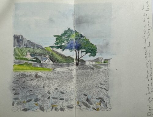
Never have I been taught anything about where to start with using colour.
I love to draw. I fill my sketchbooks. I am a big believer that anyone can draw. Anyone.
But when it comes to colour? Can everyone also create the colours they need?
I am determined to produce a foundational guide for students to use when it comes to this fascinating subject and, again, believe, that one needs to apply a process driven approach to exploring the creation of one’s own bespoke colour palette.
It is not just the linear drawing style of an artist that makes them unique but also their personal take on colour. Colour can be your calling card, the icing on the cake to your drawing. It can carry you over the finish line and has the power to make or break a piece of artwork.
One of my aims is to be able to stand and look at something and know how to create the colour I see. I need some building blocks of understanding when it comes to creating my own personal palette.
Logically, if I understand the basic processes of how to mix and use colour in order to create it / them, then I will start to achieve new success. Anything to keep me from the brown sludgy mess of enthusiastic though well intentioned mixing.
I speak from the experience of a sketchbook artist. A cobbled together as you go knowledge nevertheless grounded in some background research. My chosen media from which this guide starts is watercolours and watercolour pencils. Easily translatable to other mediums once you understand how to mix colour in your preferred material of choice.
The first book I picked up on the subject which I believe is a great grounding and got me excited about the narrative and use of colour was Felix Scheinberger’s book on Urban Watercolour Sketching.
Table of Contents
Where Do You Start Using Colours?
In his groundbreaking study of colour in his book Interaction of Colour, Josef Albers cites,
“The aim of such a study (I.e of colour) is to develop – through experience – by trial and error – an eye for colour……What counts here – first and last – is not so called knowledge of so called facts, but vision – seeing.”
We return again to the concept of seeing, first and last. Many of you know that I kick start all my courses with emphasis on how we choose to see. Its my favourite subject and one which we do not pay enough attention to as the underpinning foundational principle of learning to be creative.
The first stage to all of our creating rests in our ability to truly SEE and, therefore, be able to interpret what we define with our eyes onto paper.
We perhaps understand more about the perception of colour than we do other processes linking sight to the production of artwork. Our retinas are lined with receptors that communicate with our optic nerves. The range of colours we perceive are defined as the visible light spectrum. Wavelengths of colour are an exact science and more fantastically than this, and quite complex to explain here, is that colour only exists in the brain. This feeds into the theory that colour perception is influenced by what we expect to see! We, therefore, need to work hard to set aside our day to day assumptions and interpretations of colour and understand a colour stripped of preconception – a process I have found challenging when overmixing or trying to rely on my own understanding to capture a colour.
In addition, perhaps more so than learning to draw, colour and our understanding of it is intensely personal. It relies on our own personal interpretation. Albers again,
“If one says Red (the name of a colour) and there are 50 people listening, it can be expected that there will be 50 reds in their minds. And no one can be sure that all these reds will be very different.”
Is there such a thing as a precise shade of red? Probably not. The realisation of this fact does two things,
- Reinforces the intensely personal relationship you will have with your own colour palette. To do so will require you to develop your own process that you can return to.
- Create intensely unique artwork that in turn will be interpreted differently to how you may see it as a creator!
The first step is to also recognise that colour is a science and our ability to use and interpret it correctly should follow some rules, whether by trial and error or a more step by step approach.
Taking into account all of these moving factors, what are the logical overarching steps to take in order to understand where to start using colour?
The Basic Colours and Colour Wheel!
Doubtless, languishing like a sad circular faded rainbow in the back of your art cupboard is a familiar sight to any would be artist…the shop bought colour wheel with spinning tabs. (If you’ve not yet come across one, don’t worry, there is still time.)
The colour wheel is a tool created to support us understand the basic principles of mixing colours. It is one of those artistic shortcuts only effective when you really understand how to use it and ironically when you understand how to use it – you won’t actually need it! Mine has this rather fascinating definition of the proportion of paint you mix which I always find challenging to calculate.
Sitting and looking at my exhumed colour wheel I started to really think about where I should start with colour.
The colour wheel is a useful method by which you can build an understanding of colour.
Primary, secondary and tertiary colours are the root system of colour in general.
This in itself, however, creates challenges. What are the exact colours you actually start with that are true to being classed as “primary?”
Red is not simply red as mentioned above. I have over 20 shades of it in my art kit. (And thats only watercolour!) Add the colour ranges from other mediums, pencils, pastels, acrylics, oils….you can see how easy it is to become overwhelmed in trying to find the genesis of primary colours!
Primary Colours
Blue, yellow, and red. For the purposes of getting started let’s keep it simple.
It’s hard to believe that the alchemy of these three colours sit at the heart of ALL the colour we see around us. It is essentially the only three colours you will ever need to have.
It is a sobering thought when I take a look at my stash of 400 colouring pencils and over 215 watercolour tubes!
So let’s explore further.
Primary colours are technically colours that are “pure”. They cannot be made from mixing any other colour. When you mix these colours you get the secondary colour ranges. You can then mix the primary with the secondary colour to achieve the tertiary colour ranges, thus multiplying your colour palette.
Which blue, yellow and red to use?
The most commonly cited colours that I have found used as part of a primary colour palette are as follows;
Red. Alazarin crimson cadmium red, permanent rose.
Blue. Cobalt, phthalocyanine, ultramarine blue.
Yellow. Lemon yellow, gamboge, cadmium lemon
You may choose to add your own choices of red, blue or yellow as you become more experienced and soon enough you will be buying the larger tubes of 21 ml paint as you use them more.
One other point to note and which I explore in greater depth in my course is to remember to group the primary colours you use into warm or cool tones. This is based on the “temperature” bias of the paint or colour you use.
Warm colours include reds, oranges, and yellows, whilst cool colours include blues, greens and purples. Ironically all of these colours can be seen as warm or cool. What differentiates them is whether they lean to a proportionate amount of blue (either a cool blue or a warm blue). You will come to identify these colours the more you use and practice with them.
The more the primary colours can relate to one another the more intense the colour mix you will get from them. So learning to group their intensity is an important initial skill to develop.
Ensuring you have a selection of each of these primary colours as part of your kit is adequate as a beginner.
I won’t be getting into the deeper terminology of colour here (I.e uses, tints, shades, values, opacity, temperature or saturation). You can find a more in-depth exploration in my Guide to Sketchbook Colour.
Secondary Colours
What happens when you start to mix the primary colours together? Secondary ones emerge.
Blue mixed with yellow makes green.
Red with yellow makes orange.
Blue with red makes violet.
You can then vary the amounts of each colour you choose to mix. I set out a formulaic approach to how you can mix colours in my Sketchbook Colour Guide.
Tertiary Colours
These colours are a blend of the primary and secondary colours. You mix an equal amount of the primary colour with the secondary one you have created to develop a tertiary colour.
All of the above are thus allocated a segment on the colour wheel.
Why not try it?
Make notes on the amount of paint or materials you have used so that you can remember and reference the colour for next time.
Create Your Own Colour Wheel!
In my sketchbook guide to colour I share with you how I create my own colour wheels. Yes. Multiple wheels. In my frustration in trying to find the “perfect” unadulterated primary colours I decided that I would play with different tones and experiment.
I have over 150 tubes of paint in my collection – all different hues. Forcing myself to understand the basics with a few primary colours is a great starting point for anyone. You can then experiment with the colours you create.
Colour has depth and tone, can be cool or warm.
I quite like doing this exercise. I set out a range of different primary colours in the creation of bespoke and very merry colour wheels. Make sure that your primary colours sit in opposite triangles of the colour wheel. I noted which ones I found visually striking. I then develop the next secondary and then tertiary mixes as part of that same colour wheel, choosing the type of colours I use in my primary colour ranges as a baseline.
Starting to categorise the colours you love and how you bring them together is something I did not do for a very long time.
The first step in getting well versed in creating the primary and secondary colour mixes is to get to know what happens on paper when you make them and then mix them.
Document what you create as you go. Get scientific with it. Make notes around what you used and the proportion of paint one to another. I outline an exercise to do so in the course.
One of my early purchases when I came back to drawing was Nature’s Palette published by Thames and Hudson, a beautifully bound thick tome of a book that I adore, simply because of how uplifting and scientifically accurate the colour combinations are in reflection to the natural world.
I also love to use the suggestion of colour blends in my own work. Anything that does the heavy lifting for me!
This was a serious science in 1774 a man known as Abraham Werner started to classify the external properties of minerals and devised a dictionary of 54 colours alongside it. He revised and expanded it over the next 40 years. In 1814 Patrick Some, an artist, expanded the dictionary to over 108 colours. And so the process continued until the full creation of nature’s palette. We are drawn to the natural world especially when it comes to colour!
What Are The Other Colours You Should Have In Your Basic Set?
Most manufacturers will now provide you with a starter set of colours that you can use if you are a beginner. I started with a simple Windsor and Newton set and have recently purchased a good Derwent starter kit.
It is both fortunate and unfortunate to be blessed with such an array of colours to choose from. The hard work is done for us. Where to start with colour when you have such a vast array to choose from? Choice does not eliminate the work we must do to uncover our gift of using colour suited to our own styles.
From a range of trial and error before us, however, comes evidence of the basic range of colours everyone should have in their kit. You can create thousands of colours from this range of colours.
You need a solid foundation of basic colours which can be applied to the variety of mediums you choose to specialise in. This is normally between 10 and 15 colours. (Most sets come in 12!)
I have included a list of colours from warm and cool ranges. You can check out how to use them by visiting my Sketchbook Guide to Colour course. Although I speak from the experience of watercolour all of these colours exist across most mediums (give or take a few naming differences.)
White: Turner white / Titanium / Permanent White.
Go for a bright white that mixes well. (I love using the Schminke brand of titanium watercolour white.)
Black: Optional! Ivory black. To be used with caution as black tends to be opaque in nature.
I also love Payne’s Gray.
Cool red; Alazarin crimson
Warm red: Cadmium red light hue
Cool yellow: Cadmium light hue, lemon yellow
Warm yellow: Cadmium yellow
Cool blue: Ultramarine blue / cerulean blue
Warm blue: Phthalo blue / French Ultramarine
Cool Brown: Raw umber
Warm brown: Burnt Sienna
Cool Green: Viridian or Phthalo Green
Warm Green: Sap green
Purple: Dioxazine Purple.
If you are serious about learning about colour and where to start using it, experiment. Sometimes just picking up that paintbrush, colouring pencil, pastel or chosen medium and playing with the colours in front of you is enough to start you on a journey of appreciation of colour.
New to Emily’s Notebook, why not sign up to receive latest updates about events and resources here!


