When it comes to watercolour basics I’ve put together a guide on what you need to know.
I was first handed a watercolour set when I was 11 years old by a family friend whilst holidaying in Guernsey. I didn’t know what to do with it so I sat watching everyone else painting seascapes using their paint tins and varied brushes whilst sitting on the beach. The creations were wonderful and I fell in love with the medium, even though I spent years simply looking at my bejewelled box of paints as opposed to painting with them.
I love the watery seascapes of Turner, the Edwardian whimsy of John Singer Sargent, and one of my current favourite authors Felix Scheinberger.
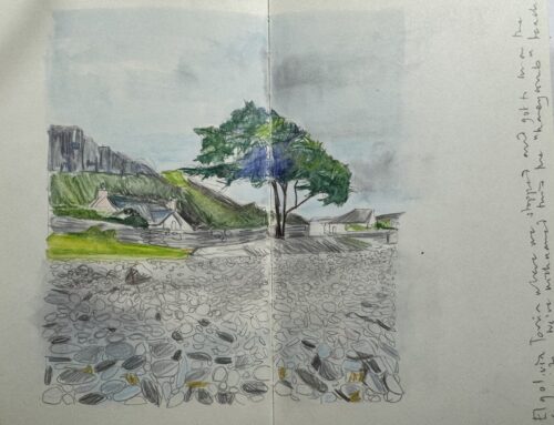
Fast forward 30 years later and I always have a set of watercolours with me wherever I go. Its fantastically portable and a unique colour solution in the sketchbook format. I still have a lifetime of learning left and have discovered so much about this unique art form in the last few years of focused practise.
There is no doubt that this is a challenging medium to use . There are so many variables to contend with in order to produce a final result. When you get it right however you’re are rewarded! Watercolour is a vastly versatile medium.
You see, it’s not only about the paint itself. It’s about the subject you choose to portray, the paper you use, and the type of brush you load up with paint. Add your own painting technique to it and you’re guaranteed to produce something unique! I like to think of watercolour painting as a personal alchemy of variables which conveys your own personal style on the page.
Even before we get to the painting stage, however, let me run through the decisions to make when thinking about getting started with this medium.
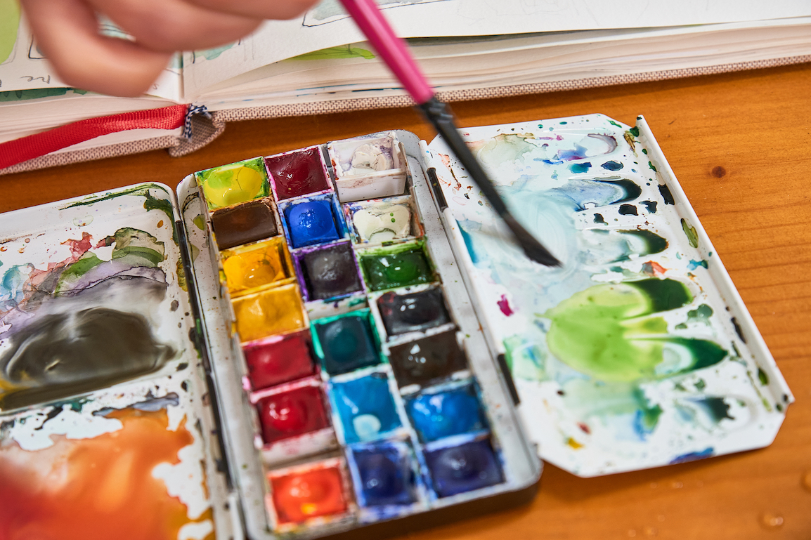
When it comes to choosing which paint set to buy there are some reputable brands on the market such a Windsor and Newton, Rembrandt, Sennelier, Daler Rowney or Daniel Smith – and anything in between dependent on your budget. If you are just starting out it is worth investing in a good basic set, of 12 or more colours. Make sure you go for a reputable brand as opposed to a cheap set. You will find good quality for whatever your budget may be. Once you progress you can then choose to invest in the brand(s) you like.
I will be covering a little about the paper and then moving into the basic techniques to use to get you started.
Table of Contents
Paper.
One of the first watercolour basics you need to know about is paper.
Common brands that I use include Fabriano, Bockingford, Seawhite of Brighton, Arches, Daler Rowney, Frisk, and Hahnemuhle. If you can afford it, aim to buy artists’ quality paper if you can. All of these papers are available too in sketchbook formats.
Ensure that paper is also labelled as acid free. This ensures that the paper is kinder to the paint you put on it.
Only certain papers above a certain weight can handle being loaded down with different dilutions of water. When you buy paper you can define which type you need by it’s a) weight and b) type.
Weight.
In order to avoid buckling or warping (most annoying) ensure that you have a heavy enough paper. If you are reading this from the US you may recognise the standard 90,140 and 300 pound weights. If in the UK and Europe this translates into 185, 300 and 640 gsm respectively.
The heavier the paper the more water it can carry.
If you keep a sketchbook like me, bear in mind that the weight should always be above 150 gsm which is admittedly on the lighter side. Weights as low as these can cope with watercolour but only as light washes. As I keep my sketchbook to work quickly, the paper is able to withstand a light wash of water.
There are three different types of watercolour paper known as hot pressed, cold pressed and rough.
I like to use the analogy of clothes and an iron when describing the differences.
Type
Hot Pressed. As the name suggests this type of paper has been treated under heat. Imagine an iron has run over the paper and flattened all the fibres into a smooth surface. This is essentially what you will feel when you run your fingers over the surface.
As the fibres are close together any water you place on the paper is more likely to sit on the surface and take longer to dry and create specific effects.
I have tended to lean toward using this type of paper as I have learned to use it in the pages of my sketchbook which have predominantly been hot pressed. I prefer this type of paper as I feel slightly more in control of my pencil markings and sketches. As I tend to work quickly too, I’m familiar with what the paper and paint will do.
Cold Pressed. This may be the paper you invariably start out on if you are new to watercolour. Cold pressed paper has been passed over by a cold iron press. The fibres are not as flattened as the hot pressed paper which means that the fibres are “thirstier” and more pronounced. The fibres, are however, still relatively uniform which means you can still control how to manage the paper. This paper absorbs the paint faster as it sinks into the fibres creating a different effect.
Rough. This type of paper hasn’t been treated and its fibres are not uniform which means you will have a different type of effect that may not necessarily be controllable.
Always make sure that whichever paper you opt for it is marked as acid free to protect your work and paint for longer.
Watercolour Basic Techniques
The Wash!
The most common technique you will hear referenced in watercolour painting is the “wash.” There are lots of different ways in which you can approach a wash. A wash is when you apply paint across a large area to help create a background or build your layers. Imagine your brush soaked in water and then applied across the page.
There are also different washes to use;
“Even” or flat wash. Load the brush with paint. I like to call this wash the base layer. Its more watery than the rest. The aim here is to get an even spread of translucent paint on the page.
Work in strokes from left to right and try and ensure you apply similar pressure on your brush so that you get an even tone. You may find that you create “puddles” of paint on the page. You have overloaded the paintbrush with water. You can absorb the extra water with your brush or kitchen towel.
Toned wash. Whereas the even wash ensured you had the same technique across your page the toned or graded wash starts with a loaded paint brush of water which creates a darker tone across the top of the page as you sweep the brush from left to right. Add more water as you progress downwards so that you create diluted bands of colours. You will be going from dark to light. Add water and not paint.
My advice would be to simply practise loading your brush with water and seeing what can be achieved on the paper. Remember too that investing in a good brush can make all the difference to your technique and the effects you create.
Wet on Wet
If you like control this technique will challenge the perfectionist in you. You cannot quite predict or control the effects of this watercolour basic technique.
This technique is based on using clean water. You wet your paper first. Then you add paint. The effects that you get may be different dependent on the different types of paper you use as well as the intensity of paint as well as amount of water. It takes a little practice to perfect the amount of water you use in this technique.
One consistent factor when employing this technique is that you need to work quickly so that the paper does not dry, although you can easily still work with a wet on dry technique even if it creates a different result to the wet on wet technique.
The Bloom Effect. The other wet on wet technique to use is where you wet your paper with basic paint washes and then load your brush with water which you allow to “drop” onto your page. The effect of wet paper meeting wet droplet creates a blooming effect on the paper. Again, experimenting with paper type and brush size is important.
Wet over Dry
As you probably can now see the art of quick watercolour is combining a range of different techniques whilst the paper is either wet or dry or a combination of both.
Another such technique is exploring the wet over dry technique. In order for layering to be successful you must first ensure that your base layer is dry.
Watercolour is perhaps one of the only mediums where you can layer colours on top of one another to create a translucent and shading effect. You can use different colours layered on top of one another as each layer drys. Beware of overdoing it! It becomes difficult if impossible to rectify! The type of paper you use will give you a massive clue to this as it will start to warp and buckle under the pressure of the water you place on it. Adriana Buggino captures this perfectly when she says;
“Perhaps watercolour is more art than acrylics or oil, because the opportunity to correct errors is very limited as the colours are transparent… The sun, wind and temperature influences water-pigment-paper!! Everything flows, painting with watercolors!”
When you layer paint this is also sometimes referred to as glazing. You can add different strips of colour once the layer of initial paint has dried in order to create shadows and tones. It becomes a fun experimental thing to try when you are starting. You always paint from light to dark as you build gradations of colour. This is why you will sometimes see people experimenting with different swatches and recording how they have mixed the paint.
Stumbling. This is an effect that is used to enhance the tonal depth of an object. You create broken patches of colour over another colour. You are layering paint to accentuates the tone or patches of an object. This is predominantly used for objects.
Splattering. You may have seen artists splattering their paper with tiny droplets of paint. This is common for quick watercolour sketches to convey a sense of movement and energy in the absence of having enough time to fill more colour. It makes for an interesting and satisfying technique. Your splatter should almost always reflect the colours of your painting, and be applied minimally as you can overdo this technique. Simply load your brush with watery paint, hold it relatively close to the paper and tap the handle of your brush with short sharp movements.
The Dry Technique
From one extreme to the other, the dry technique allows you to stay in control of the paint you administer on the page. The paintbrush needs to stay relatively dry as you load your colour. I like to use this technique over a wash or even on wet paper.
When working quickly I tend to minimise the layers of watercolour I apply to the paper to 3 separate and distinctive layers. The wash on the bottom, then a wet on wet technique or the next tonal layer and finally the third layer where I focus on keeping the paintbrush more dry but loaded with paint.
I often also use it to accentuate shapes and lines. You can also use this technique to explore creating different effects on the paper. Think about the different types of brushes you can use here to enhance textures. Pointed, fanned, or a dagger brush support you create a range of different results on the paper.
Remember too that earlier on in the article I spoke about working from light to dark shading and layers? Your dry technique can be used on accentuating the darker and final shades of an object or item.
In summation, watercolours are a tricky medium to navigate and one that requires lots of practice, a surrendering of control and a willingness to experiment with many variables ranging from good quality papers, colours and brushes, as well as the different techniques by which you apply paint to the page.
Have you joined Emily’s Notebook Community yet? Be sure to sign up to access free resources, notifications of free events and further news about upcoming courses!